Showing posts with label color. Show all posts

Monday, January 07, 2013

Head of a Girl 14 or Marilyn in Rose and Dreaming

Head of a Girl 14, or Marilyn in Rose
ink wash on watercolor paper
4.5" x 6"
1/6/13

I've been thinking about dreams lately... not the close your eyes at night kind, the big kind, the kind that get you up in the morning and get you moving. The kind where you envision a life that you'd love living. The kind that are about goals and wishes. Those kind of dreams.

Marilyn Monroe was a dreamer. She put herself out there and she was hurt. She never stopped being vulnerable and I think she achieved her dreams... although perhaps sometimes those dreams ended up being painful and sometimes she had to sacrifice for them and she definitely experienced loss in their pursuit.

When you commit to your dreams... what happens?

When you take steps to achieve your dearest goals... how does your life change?

When you accept that this is the risk you are willing to take and this is the cliff you are willing to leap from... how do you learn how to fly?

btw Marilyn is for sale in my etsy shop
https://www.etsy.com/listing/119788654/head-of-a-girl-14-marilyn-in-rose-ooak

Friday, December 07, 2012

Re-Vision and the Past 93-95/100

 re-vision
acrylic on paper
93/100

I spent all morning and afternoon painting yesterday and then ran out of time to post. I am slowly catching up to my 100 works in 100 days goal. Of course, I've been neglecting other things. Well, life is about sacrifices isn't it?

I feel like today's post shows a departure for me. I'm not quite sure where it's going. Maybe it is more intentional and less improvisational. I'm okay with that, although it takes a lot longer to do. Thus all day painting and running out of time.

I did start with a symbol, the eye, one that has been a common refrain through out my artistic life. Mostly doodled on notebooks when I was a kid. I read somewhere that it was something about "being seen." I don't know. Maybe that's go something to do with where my head is at nowadays.

I know when I got intentional with it, I began to think about what I KNOW my life is about nowadays, and that is reviewing my life, my work and my goals, and revising and re-visioning it all. I kind of like that I am taking symbols from the past and rethinking them again. Or art supplies from the past and seeing what I can do with them. Or vintage photos from the past and recreating them from my perspective. (I found piles of photo albums from my own family, my ancestors. I should really try to incorporate them.)


this bowl is full of hope
acrylic and graphite on paper
94/100

I saw an illustration of a bowl somewhere and since then, I have been slightly obsessed with the symbolism of the bowl.

It is an empty receptacle. It holds whatever it is you put in it. It is also used to hold offerings, to other people, to the gods, to yourself. You can not fill the bowl unless it starts out empty. The emptiness of the bowl is what allows it to hold the gift, the sustenance.

I drew it in pencil and painted half of it. It is not unfinished. That was intentional. There's something about the bare bones of pencil drawing that I like. As if it is being created. It is also without color. It is work a day, functional, not really meant to be shown. It is what belongs underneath the surface.

I also wanted to show the marking lines for the words. This bowl is laid down to it's essence, this is what it is made of.

The inside of the bowl is the color of a spring sky. Hope. The outside is a pattern of pencil circles that remind me of stones.

The background is half painted with the swirls, kind of reminiscent of steam, or vines. Something growing, something rising. I painted it with titan buff, because I wanted it to still be white, but a white with color, as if it was hope alone that changed the plain white paper of the table to the color.


head of a girl 13 (tori amos)
ink wash on paper
95/100

I saw a High School picture of Tori Amos, and although she was not "quite" as vintage as the other photo sources I've been using, there was something about the loveliness, the imperfections, the romantic curly hair, the youth and hope of a girl who would become something powerful and darker as she grew... I just wanted to paint it.

And I wanted it to be pink and girly and dreamy.

She doesn't really look like her, but I wasn't really trying to make her look like Tori Amos. It was the feel that got me and the feel I was trying to convey. I thought a too-close portrait of Tori would be distracting.

Well that's what I did yesterday. Hopefully I will be able to paint some more today so I can keep my momentum going. I have four more days of my self imposed challenge, and only five more pieces to do.

I CAN DO IT!

Tuesday, December 04, 2012

Belief is the Theme, 80-84/100

 Head of a Girl 12, red and sepia
ink on paper
80/100

I'm going backwards with this one. When I found my red ink, I started experimenting with it. I was not happy with my use of the medium until the last one I did, which was this one.

 "I draw my hand..."
ink on paper
text reads [I draw my hand to say to the world and myself, that I am the maker. I do. I create. In my hand I hold the power to guide my life. The hand is the tool of human agency. The hand allows us to create the the {sic} world that our big brains let us IMAGINE. That's right. The hand allows us to be human because it allows us to create. And because we can create, the mind is free to dream up all that is ever possible. Between the mind and the hand, we become creators, we become the heroes of our own stories-- Rowena Murillo]
81/100

Then I saw something where red was combined with black, and I said, aha. I will add my sepia ink to the red ink drawings and see what happens. It worked, with various levels of success. Here, adding the text gave meaning to the not very good sketch of the hand, turning a failing piece into a successful one.


believe
ink on paper
82/100

Believe is the current theme. I actually liked this one the best, so I left it the way it was, without sepia ink.

believe that you can figure it out. And if you can't figure it out, you can figure out a way out of the mess. And if you can't figure a way out of the mess, maybe it wasn't that important to begin with. -RM
red and sepia ink on  paper
83/100

I liked this one the least, even with sepia ink. I had the medium all wrong.  The red was too heavy. My brush was too thick for what I was attempting, and my vision of what I wanted was not clear enough for me to even get close to it.  Oh well. I take it as a learning experience. Thus the added words. This piece is the one that isn't "that important to begin with."


Trust In You
acrylic on paper
84/100

This is the same theme, but different style and medium and technique. I do not know where the animal mask idea came from. It just came upon me and demanded to be painted.

Still behind on my 100 in 100 days goal, but if I do three a day, I will make it. I can do three a day. I hope.

Wish me luck.

Oh, and if you have any insight into what the final piece, Trust In You, actually means, I'd love to hear your interpretation. I think it's a deer. It might be a fox. I am not sure. But why is it a mask? And why is it combined with the words? And why on a black background? Anyone want to analyze it?

Friday, November 30, 2012

Revisiting and Working, 78 and 79/100

This Shore
acrylic on paper, moleskine
78/100

This is a revisitation of an idea from the beginning of the challenge.(The Other Side of the River). I just thought I'd see what would happen if I did it again, after playing with the ideas and colors for the last few months. It seems a little deeper, if less spontaneous.


Selfie (revised) Blue and Gold
ink and acrylic on paper
79/100

Here's another revisitation. I didn't like the ink wash self portrait I did yesterday, so as I had nothing to lose, I thought I'd see what would happen if I added paint to it. I stuck with the color scheme of prussian blue and quinacridone gold. Adding a touch of titan buff. I like the painting better now. I think I fixed the flaws. I'm kind of hard on my self portraits though. It's hard to deal with your vanity, looks wise and painting wise, and see the ways you fall short. But whatever, it's an exercise, right?

It's interesting how these portraits have gotten more realistic. I haven't really done representational art for a while, going with the more abstract or illustrative styles, but I spent many years painting and drawing real life, and it is kind of like getting back to my roots.

Do I know where I will go with this? Nope.

It's enough to do it, right now. It's enough to step out on the creative journey. I don't need answers yet, I just need to keep working.

Still 21 pieces to go before I finish my self challenge. It's about 2 pieces a day. I've caught up a bit. Just got to keep working, though.

Thursday, September 20, 2012

To Remember What has Been Forgotten, 14-19/100 in 100 days creative challenge.

 the rain,
acrylic and ink on paper
14/100

I think there is a lesson to be learned in the ways life gets all complicated and messy and stops working, whenever you've actually started something that will get you where you want to go.

I suppose this is the equivalent of rain on your wedding day, or that black fly in your chardonnay.

Now, I'm not saying it's ironic, I'm just saying perhaps there's a lesson to be learned.

For instance, today, when I wanted to post my back log of 100 in 100 days paintings, my blogger stopped working.

All these great intentions coming to naught.

 She thinks of flowers
acrylic on paper
15/100

It has been said that life puts obstacles in your path to see how much you really want your goals and how hard you will work to achieve them.

Hmm.

It's something to think about. Is it worth it to go after that dream? We can all have happy lives living smaller, can't we? Following the beaten track? Loving and being loved, that's a beautiful thing and completely worthwhile.

If you stopped struggling, trying to reach that goal, and just let yourself be happy in the moment, that would be a wonderful thing... so why are you still struggling? Is there something there that is more important to your life than you have admitted to yourself?

 Pattern
acrylic on paper
16/100

I don't know.

Maybe yes, maybe no. But maybe we need to pay attention to the way life keeps repeating itself. Maybe what's important keeps coming up. Maybe those lessons you haven't learned yet, the ones you keep resisting, maybe those keep coming up.


 Harvest
acrylic on paper
16/100

I hope you have enjoyed my abstract collection of thoughts, philosophies and paintings. It's hard to make sense of things sometimes, when they seem to be all over the place, without singular theme. I am liking the blue/orange thing, and the experimentation it allows... although I'm starting to get bored of the color. I think I've gone pretty far with it.

 Forgotten People
acrylic and ink on paper
18/100

This one is my favorite of the recent pieces.

Sometimes I get it right, I hit a nerve, although I never actually know which piece is going to strike a chord with me.

There are a few things I am repeating here. The blue/orange color scheme. The silhouette of a standing figure (also known as grounded girl in my lexicon, although she doesn't look that grounded to me, and she has feet, where grounded girls don't always).  Another repeated theme is the orange dots/circles/flowers or whatever it is they are.

Sometimes the themes repeating seem to resonate with something else and from that resonance comes a deeper meaning. I think this one has it.

the remembering
acrylic on paper
19/100

The next one is clearly following #18. Forgotten People leads to The Remembering. But this one does not resonate as much. Why? What happened? What failed to happen.

Again, I don't know. I don't know where the journey of each piece will lead.

Every bit of life is an experiment. Every bit of life is an adventure.

Perhaps what needs to be learned here is that we have to take life for what it is, the good and the bad, instead of what we think it should be, or what is lacking. Perhaps we need to keep trying, even when what we try doesn't work out so perfectly. Keep going on that journey. Keep looking for the answers.

Friday, September 14, 2012

Inside, Outside, Upside Down, 11-13/100 Days Creative Challenge

 The Other Side of the River
acrylic on paper, 9/10/12
moleskine
012/100 in 100 days creative challenge

Boy, I am having a challenge keeping up with my 100 in 100 days creativity challenge. I was doing really well with the painting/drawing portion, going off on binges of paint and ink, and then...I just got stopped. The chaos of life and necessities of things I have to do and unexpected twists and chores and the paying kind of work and kids and blah.

But I never said this challenge would be easy, or smooth, and while I have gone through periods of painting every night like clockwork, day after day in a routine that kept me productive and creative, that is never a guarantee and sometimes, it's really hard work to get to that point.

I know life can get in the way.

The point is not to do the challenge without ever being challenged, the point is to meet the challenges, and find a way around them.
 Inside (drawing)
ink on recycled menu, 9/10/12
4"x8"
011/100 in 100 days creative challenge

I'm doing a lot of examination of my life and my art I think, trying to figure out where I want to go with it. Trying not to have the answers. I suppose what I am painting now does have more questions than answers. Is more mysterious, less about illustrating a point. I don't know where it is going, but I am trusting myself to be able to continue on in my journey, to be able to handle whatever is thrown at me.

The things that I thought would be easy are not so easy. The things I thought would be the main struggle are not an issue at all.


the light inside
acrylic on paper
8.5"x 5"
013/100 in 100 days creative challenge

I think I am in a blue period, like Picasso's, just by chance, because those are the colors I pulled out of my paint bag, and those are the colors I have been using for the last two weeks.

The last few times I did this challenge, I would pull out three or four different paint tubes and let my nightly painting be inspired by the randomness of the color scheme. I was surprised and delighted by this painting prompt sometimes, and came up with some of my favorite paintings out of it. Of course, sometimes the painting sucked, but that's ok.

This way of going at it, using the same color scheme again and again with different emphasis on the colors, using some similar techniques, using a limited palette, well, I kind of like it. It feels more poetic and less illustrative to me. It goes deeper. I don't mind. I find myself picking up additional paint tubes or media to add to my three tubes of paint. I don't mind that. As an exercise, I like the ability to become fluid within my constraints.

I know a lot of people think that being an artist is about being free and having no boundaries, but I think the truth is, it's often about it's often about looking through that one inch frame and seeing how infinite you can make that tiny space.

Well, I've run out of time. I have to get ready for work. Before I go, I did want to tell you that I have gotten back to my novel. I am up to chapter three in the revision in my first week of working on it. I don't know how quickly it will go or how consistently I can manage it. I've already found it a challenge to get back to it. I guess we'll see if I can manage to juggle my life of kids and work and chaos and painting and writing. Perhaps the painting and writing can give structure to the chaos.  We shall see.

Friday, September 07, 2012

Woman in Triangles and Woman Lost in Stripes, #9/100 and #10/100

Woman in Triangles
acrylic paint on paper
9/100 in 100 days creative challenge

I have decided to do less story telling about my paintings. I'm okay with not knowing what exactly is going on in them. I'm okay with not having the answers in my art. I saw this vintage photo  of Nita Naldi, sultry silent film star, and it led to #9.

I don't really know what I am doing with it or where I am going, but I am going in this direction, whatever it is.

It really is the most important thing about creating art, I think, committing to making art. Committing to each work of art. Committing to yourself as an artist. Committing to your vision. There's a lot of trust involved in committing to art, or to anything, for that matter. You are trusting that it won't be a waste of time, that you will like what comes of the commitment, that you won't be hurt by what comes up.

There's a lot of bravery involved in committing, a lot of bravery in following your heart.

Woman Lost in Stripes
Acrylic Paint on paper
10/100 in 100 days creative challenge

Especially when you don't know what will come of it.

Thursday, September 06, 2012

The Creative Process and Commitment.

Big Girl Pants


Big Girl Pants
Acrylic on Paper


I've been doing a lot of drawing with acrylic paint. I guess it's technically painting, but it feels like drawing to me. 
A few days ago, I took out a couple of tubes of paint and brought them to my Sittin' Chair, where I have my mom office, where I sit and go on the computer or watch the kids or drink my coffee or write in my journal or whatever. My command station, if you will. I was inspired by this from Louise Bourgeois, because it reminded me of the doodles I used to do compulsively when I did more sitting around listening to lectures and meetings and such. I figured, if Louise Bourgeois could do it, so could I. I only picked a blue, like Louise, and a random, pull of the draw, Quinacridone Azo Gold. I figured I could do something with those two colors. Now every time I sit in my Sittin' Chair and have the urge to do something artsy, I pick up my journal and my paintbrush, and squeeze out some Azo Gold and/or Prussian Blue.   Following this, things happen. Things I do not plan. Things that have me wandering down paths I did not predict. I am okay with that.

Be Your Best Self (gold)
05/100 in 100 Creative Challenge

This was the first thing I did. 

A kind of reminder to myself. I enjoy lettering, even though I don't think it always looks perfect. I guess I don't want it to look perfect. I like the rough, human element. I like that it is not mathematically correct or symmetrical, even. 

Plus, I think this is a good reminder. It's not about being perfect. It's not about living up to who people think you should be. It's not about sacrificing yourself. It's not about blaming other people or doing things out of spite or out of obligation.

It's simply about being the best you that you can be. It's between you and you, and nobody else. And being the best you makes you happier. And it makes those around you happier.


Be Your Best Self (gold and blue)
06/100 in 100 Creative Challenge

Okay, I fibbed. First this is the one that came out. But I tried a design in gold and I just didn't like it. At all. So I scrapped it and did the plain gold one from above. So the plain was the second started, but the first finished. There's something to be said for plain and simple. But I also like embellishment and pattern and doodling! So I went back and said, hey, I already ruined it, why don't I experiment a little.

So I added the organic doodle pattern. Is it perfect? No. I still think the composition is off and it's crowded and not quite what I was thinking, but I do think it's interesting. This is perhaps a step in the direction to where I am going with all this. Not that I know where I am going with all this.  But the best me trusts my own instincts and trusts the process and is not a nitpicky perfectionist. The less than best me has problems with those things. So I decided to go with the best me and show it anyway. Plus, you notice, I'm counting it in my 100/100 Creative Challenge, even if it's an imperfect draft. This is a positive attitude, I think. 

Untitled (Blue and Green Organic)
07/100 in 100 days creative challenge

 The next thing I drew, was more doodles. Again, didn't know where I was going, just let it grow organically.  It was all blue, and I wanted more color, but I didn't have more color at my Sittin' Chair, so I went for the Azo Gold and added a dollop to my palette of prussian blue. Voila, a kind of khaki piney green. Good enough. I added more doodles and embellished the original kind of plantish kind of shape.

I still might go back into this one and add more gold. Or not. I am letting it develop.

Big Girl Pants.

This one is my favorite, though.

Same two paints. Same journal. Adding one more external inspiration to the mix though. (the link leads to this article which is incredibly fascinating, but it was the illustration that inspired the drawing, which is really just using the media to draw a person, but inspiration is funny that way.)

I did it this morning. (I should be writing again, but I have not settled down from the excitement of back to school. I will be writing again. I promise. I'm going to. Shh. I know I'm making excuses.)

I drew her out in the same prussian blue, in a loose style, because sometimes I get frustrated with my own fussier styles of painting, with my favorite stripes. I spent a lot of time drawing little fashion drawings a few years ago. A kind of  "what I wore today" thing that also illustrated my life as a stay at home mom with artistic urges. When I was young, I wanted to be a fashion designer, took some classes, but didn't go in that direction. I still find that my drawing is influenced by fashion drawing. At this point, I think I might be interested in moving away from that idealized and glossy slim caricature of women. I might be interested in drawing pictures of women who are more squat. Much like myself. 

Anyway, you are learning a little bit about my creative process. I'm letting you behind the curtain here. I often don't know what I'm doing but am running on vague feelings that something is cool or something bothers me.

The background here was supposed to be flowers. But they did not turn out to be flowers. I don't know what happened. I just know that right when I started, I said, "these don't look like flowers," and rather than forcing them to look like flowers, I committed to whatever they were and I took them all the way. 

I kind of like how they turned out. They are slightly ugly, slightly menacing... to me anyway. They look a little bit like microscopic things. Or stones. I kind of think of them as stones. Troubles, maybe.  This was not a problem for me, because like I said, I get frustrated with my fussier styles, and I also get frustrated with my urge to make everything pretty. If the background went from flowers to microscopic, stone-like troubles...I like that tension. I don't know. I think that's what takes art into the next level. Tension, contrast, questions, mystery. Maybe I need to have more of that and fewer answers. Hmm.

That is something to consider.

Anyway, it's been a while since I've talked about my creative process like this. It feels good and I think it did me some good. It means I am getting to be more conscious about my artistic choices. Part of committing to being creative means thinking about being creative and the process and methods. 

This is how we go deep. 


Wednesday, September 05, 2012

Grow/Sun and Shadow. 04/100 Days Creative Challenge

Grow/Sun and Shadow
acrylic on paper
9/4/12
04/100 days creative challenge

I am taking this challenge as an organic one. Much like this drawing. Each day will grow out of the last one. Each painting will come from the last one. Each one leads to one. Like baby steps, leading to the end of the journey.

I don't know where I am going when I take my first step. At each step I look and evaluate where I am and what looks like the next best step. I ask myself, do I like where I am going? Does where I am going feel right? If yes, I continue. If no, I take a look and see if there is anything that I DO like about where I am. I go off in that direction. Or I see if I can adjust it somewhat to fill my needs.

Or I scrap it and follow some other dream/desire/necessity.

I don't have to know where I will end up. I just have to know who I am, what is most important to me, and that I will keep going until things start working out and making sense.

Yes?

Yes.

Babysteps get us where we want to go. We don't need to have the whole journey figured out when we start.

Monday, September 03, 2012

Do It/ Hand 02/100 Days

Do It/ Hand
mixed media double spread on paper
9/2/12 art journal
2/100

I have been playing with my turquoise paint for the last few days. This color always makes me feel happy. It reminds me of blue skies and hope and birds and dreams.

I didn't know where this journal entry was going when I started it. I'm still not really sure I know what it means, but I know it is part of where I'm going.

I like doing these 100 things in 100 days challenges, because even though I may not know where I will end up, the consistent habit of sitting down to create every day means that I am developing my vision and my voice.

Something will come out of this project, as long as I show up and commit every day.

What about you? Would you like to give it a chance? Let me tell you, I say "I can't" on a daily basis, but the truth is, if I just do it, I certainly can. Many things are hard, but that doesn't mean they are impossible, and you get so much out of committing to them, even though you aren't sure, even though you are afraid, even though it seems like so much work.

If you want to try to paint 100 things in 100 days, give it a shot. Or cook 100 meals in 100 days. Or create 100 toys, or knit 100 hats, or write 100 poems, or what have you, give it a shot. What do you have to lose?

Tuesday, July 31, 2012

DIY Harry Potter Wands II: Paper Mash, Kraft Paper, String and Paint.


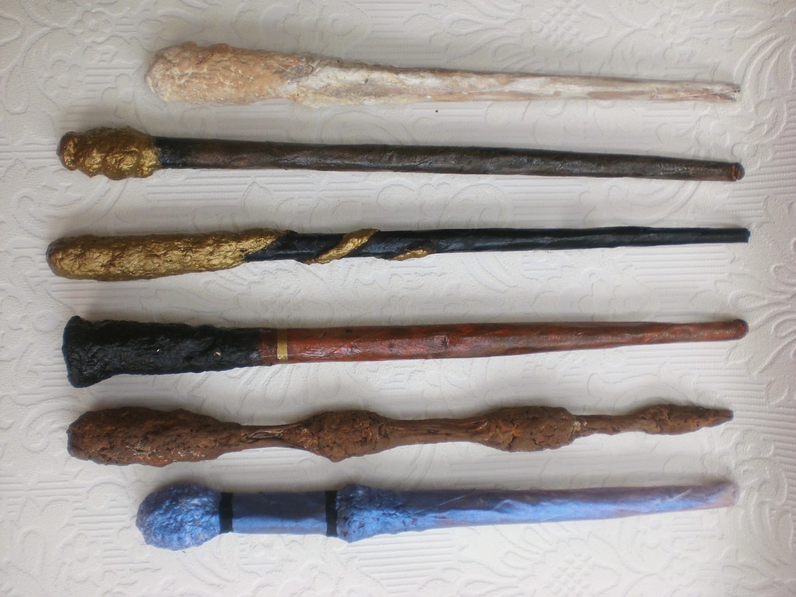
 Paper Mache Harry Potter Wands, embellished with paper pulp and paint

Welcome back to my Harry Potter Wand tutorial. Part two.   Yesterday was part one. Check here for how I made the paper wand blank and for how I embellished some of the 21 wands. Today I'm going to talk about another embellishment technique that is a bit more labor intensive, but ends up with some impressive results, in my opinion.

This is the paper pulp portion of our adventure. There are many ways to create with paper mache. We start out when we're kids, maybe, with the water/flour paste and strips of newspapers on balloons, sometimes we might move on to fancier paper or fancier glue. And then there is the paper pulp fun, where you take little bits of paper, soak them in water, mix them with some sort of fixative and then mold them like clay.
 That is what I did here. I used this tutorial for paper pulp ala Miranda Rook. It takes some cardboard egg cartons, some glossy magazines, water, electric equipment (mixers and blenders) some big bowls or containers for soaking and mixing, and strainers... a colander and cheesecloth or stockings will do.

I'm not going to do a tutorial for this, because I pretty much just followed Miranda Rook's instructions. Plus I forgot to take pictures and hers are great.  I wasn't sure how well it was going to work out, so I only did a fraction of her recipe, using one large 18 count egg carton and about half of a small glossy. It didn't make nearly as much as hers, but I knew I wouldn't need so much for just a few wands and wasn't sure if I'd use it again.

So after soaking my paper and combining it well with a mixer, I took a bit and mixed it with my white glue to make my first batch of wands. Since I did my wands in a couple of batches, I followed Miranda Rook's instructions on storing the pulp and rolled the leftover into these little balls that I set out in the sun to dry.
 They dried well and made nice hard balls. I followed Miranda Rook's instructions again and took a few of the balls and set them in my bowl with some water. Not too much because I didn't want it to be soggy I just wanted it to be mashable. I broke the balls apart as the water made them soft and kept breaking them up as I added small amounts of water.
 Then I added more of my trusted white glue. I mixed this with my hand mixer. If it were a bigger batch, a stand mixer would work better, but I was working in small batches so it was okay for me. I blended it until all the glue was mixed in and if it wasn't mashy enough or sticky enough I added more glue. MORE GLUE! (this has been my refrain the last few weeks.) The one thing I would have liked to do with this mash was to blend it even finer with a hand blender or in a regular blender. My blender was broken so I went with the bumpy mash. It adds a nice texture, but I would have like to have seen what could have happened with a smoother mash.
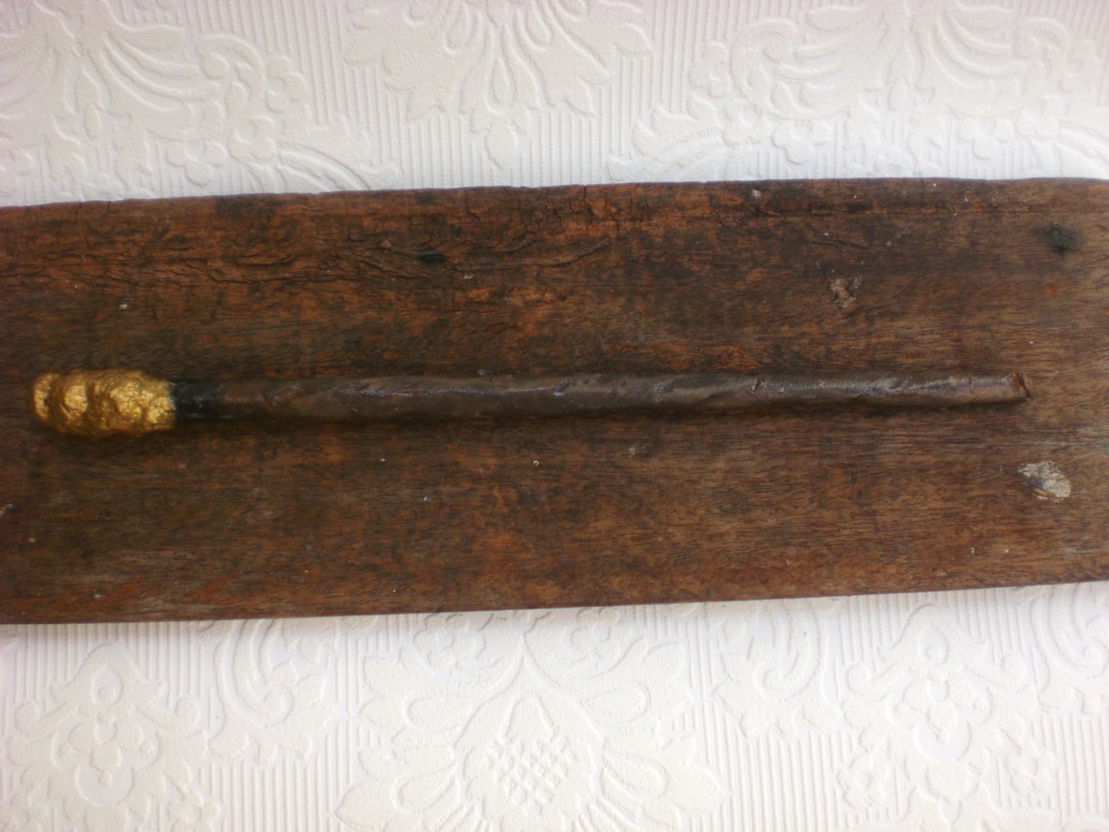
Once mixed well with the glue, I got out my wand blanks.  Yesterday, I mentioned that it was okay if some of your wands weren't perfect. If they were wrinkled or bumpy.  This was the first wand my son made and he got upset because it was all wrinkled. I told him not to worry, because I could almost see The Elder Wand in the bumpiness. Instead of trying to straighten it out and smooth the wrinkles/bumps or just tossing it in the garbage as a loss (it is only glue and paper, after all,) I emphasized the wrinkles, squeezing and smooshing the original blank into something that was less sleek and more organic looking. Then I took out paper pulp and added more pulp to the bumpy parts, emphasizing them, smoothing them on, compressing them around the bumps and adding a nice hefty clump of mash as a handle.

In the end, this was the "messed up" wand. It's a beauty. And the one my son actually chose for himself. I chose the most flawed wand blanks for the paper mash. I worked with the wrinkles to make them unique and give them personality.


Some were too wide, so I made them wider and solid.


Some did not have round shafts, so I made them more angular.


Some didn't have enough glue at the grip side, so I covered the soft paper with the bulky pulp which dries very hard.  The soft handle was actually a common problem I had, and paper pulp was not the only solution for this problem.

And that brings us to another family of wand embellishments.

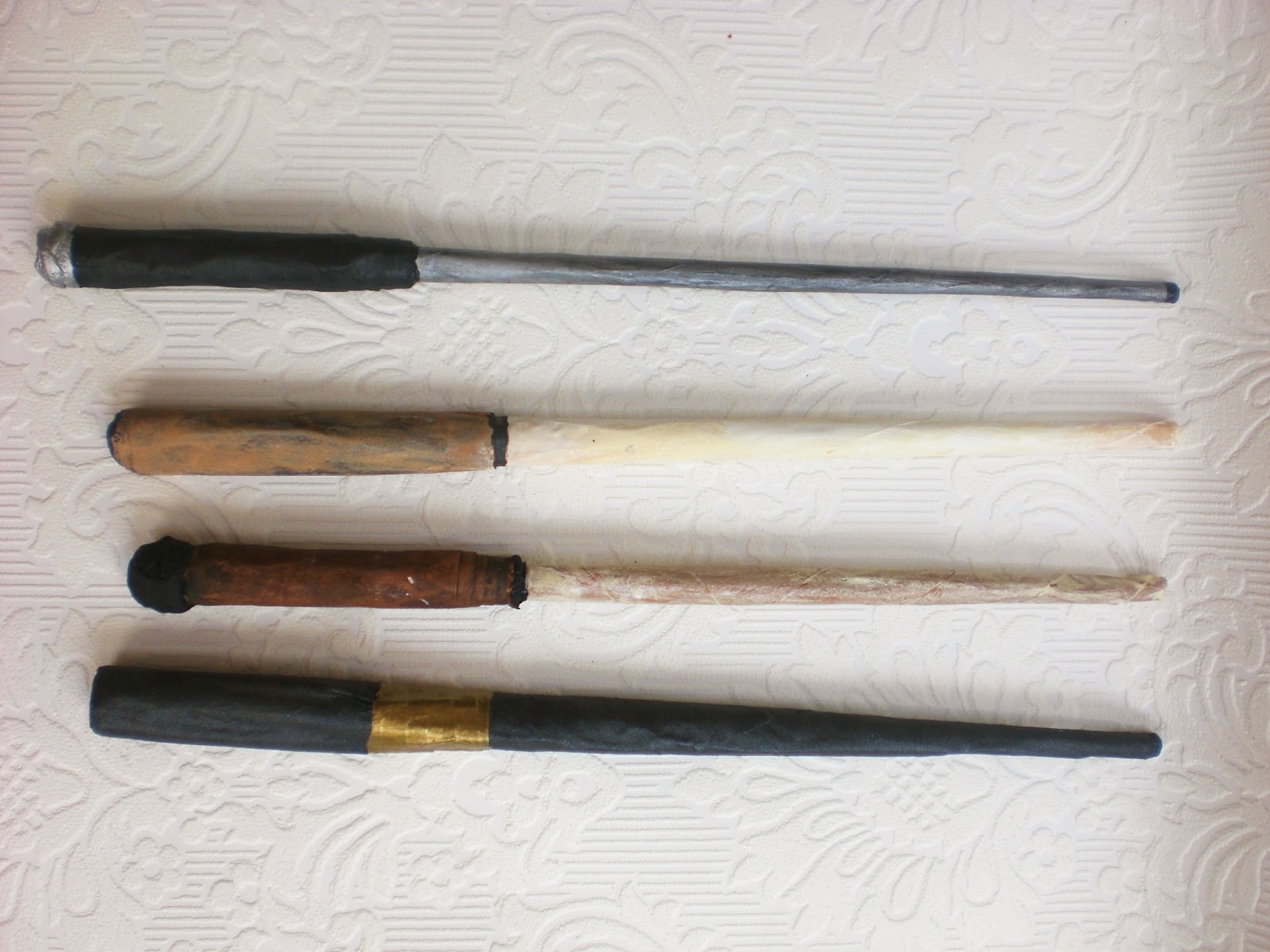
 Wrapped Kraft Paper Handle Harry Potter Wands

This is a simple embellishment and all it takes is a strip of paper bag and more glue. (MORE GLUE!)

You want to cut your brown bag/kraft paper in a slight taper so the outside edge is narrower, because that will make the hand a little bit graduated on the wand. Add glue liberally and roll it tightly to the wand handle, much like the original wand construction. Smooth out the wrinkles and bumps as you go and when the whole handle is wrapped, smooth the glue out.

For most of these paper bag wands, I added a twist for a pommel gem or where the grip meets the wand, but I didn't do it for all of them. It's just another embellishment. For one of these, I dipped a braided cord in glue and wrapped that around the top of the handle.

And that leads me to the last of my embellishment catagories.

 String Wands.

This is my least favorite embellishment. Sorry. It's easier, but I found that it had the least modelling capability and the string dries hard, with a distinct string texture. It works, but it's not my favorite. The silver one was yarn, and the yarn and glue together made an almost rough texture which reminded me of metal. That's why I made it silver. The bottom one was cotton twine and while I kind of like the way it looks on the handle, I don't like the way it feels when I grip it. Well. We'll see if any of the kids choose my least favorite wands as THEIR favorite. Shh. Don't tell them these are my rejects. One person's trash is another person's treasure (says the avid repurposer.)

I suppose at this point, I should talk a little bit about the painting techniques. I do not have any tutorials for these because I just went on my gut and my hands were really messy and full of wands and paint.  But if I think back over it, there are really only two techniques I used.


The easiest is the flat effect. This is just an opaque layer of paint in one color. It might or might not have a layer of glossy mod podge (I found it too sticky for grips, so it was only on the wand shafts) or gel medium or even a glaze of iridescent fluid acrylic.  Silver, black and gold gave the best flat effect, I found.


And also I had a dark mica paint that I got many years ago and doesn't work for when I paint pictures. This was the perfect use for it.


A bit more difficult was the layered paint effects. This consisted of a base coat and then one to multiple (and I do mean multiple) following layers of thin paint that I then rubbed off with my hand. I found using my hand made the best effect sometimes, avoiding brushstrokes and giving it a more natural variegation. Plus, I was careful not to use too much paint for each layer, because it doesn't rub off very well if the paint is applied thickly.

I found the layered effect worked best with browns, tans, ivory and white. Blending the colors gave a natural wood or bone feeling. And sometimes I found the browns too flat, so I would dab on some orange with the brown/tan and blend it on as I went.

I found that adding the lightest colors first, and then putting on darker layers as I went worked the best, although a little bit of lighter color added to a darker color could also give a feeling of age/dimension.

Whenever a wand didn't look right, I would just add another layer of color until it made me happy. Sometimes that meant a solid layer of color changing the entire color scheme. Sometimes it just meant another thin layer of brown that I then wiped off


And then there's my daughter's request. A pink wand. And I had to get over my resistance to the pink wand (Harry Potter wands aren't PINK!) and find a way to put it together. This wand is actually a graduated base layer of orange blended with white, a little bit of tan, and then an iridescent glaze on top. The blue iridescence altered the orange to a vaguely pink color. Win!

I wish I had the presence of mind to photograph the painting techniques, but I was too involved in the actual painting, which is often that case when I craft.

If you have any questions, feel free to comment and I will answer. Also, I'd love to see if anyone makes a wand with any of these hints, or finds new solutions or new embellishments or new techniques. They can be lots of fun to make and they look so impressive considering the materials and effort involved. I mean,with a little bit of paper, glue, and paint, you too can be called Ollivander.

To check out the previous post and see all of the 21 wands, click here.

Tuesday, July 17, 2012

Refashioned Skirt: Bleach Stripes DIY


Bleach striped skirt, 
refashioned from a stretchy old black pencil skirt 

I have been mulling over the creation of this skirt for quite some time, wondering how I could manage this. I've been researching ideas on pinterest and putting them on my do it yourself upcycled tshirt board. I know it says t-shirt and this is a skirt, but I play fast and loose like that with my board titles. It's really about upcycling old clothes. Which is what I did here. And again, I did it fast and loose. Hey, I guess it's my thing.


 First I picked my item to upcycle. I was originally thinking I could turn a striped tshirt into a skirt, but when I realized I already had a black skirt I rarely wore and was willing to sacrifice if it didn't turn out right, my decision was made. I took my skirt and found a flattened cardboard box that was approximately the same dimensions. Then I slid the skirt over the flattened box and straightened out all the wrinkles. I taped the stripes out on the skirt, using packing tape. I've heard painters tape and duct tape can also work, but I was worried about the duct tape pulling the fabric of the skirt, and I didn't have any painters tape.


I took my whole skirt/cardboard/tape contraption out onto the back deck, laid down some newspapers to keep the mess contained and took out the bleach. Warning: Also wear clothes that you do not mind ruining with bleach stains.  You can see my bleach mixture here, in the tupperware. It's about 50/50 bleach and water. I played it safe, since I've never done this with bleach before and I didn't want to ruin the fabric with a bleach that was too strong. I had a nice new paintbrush to use, and it worked perfectly for my purposes. And yes, I probably should have used gloves, but I barely touched any bleach and had no problem without gloves. I didn't even get any bleach on my clothes. This time, at least. Oh. P.S. I did this outside. Make sure you have good ventilation and your work area is covered/safe from bleach splashes. This projects has the potential to be tragically and permanently messy. Be careful. This is not a project for kids.


 So here I am beginning to paint on the bleach. I saturated the hem and moved onto the next stripe. You can see the bleach already beginning to work, lightening the bottom stripe to brown. Forgive the off kilter photos here, I had a bleach brush in one hand and a camera in the other and was starting to panic when I saw the color start to change so soon. I sped through the stripes, making sure to saturate the bleach through any wrinkles. I was okay with it if it didn't come out perfectly. My original plan here was to paint the stripes on without the tape, but I'm glad I used the tape. It kept me from panicking even more and gave me a guide, and kept the bleach off of the areas I wanted to keep black.


 After I finished bleaching the stripes on one side of the box, I flipped the box/skirt over. You can see at the sides that the bleach has already taken out a lot of the black dye.

 Here is the back side of the skirt after I bleached it.

At this point, my panic took over again. I wasn't sure how the bleach would react and was afraid of leaving it on too long and causing the fabric to burn away. I yanked the cardboard out of the skirt and pulled off the tape... luckily, it mostly came off all at once when the cardboard came out. I tossed the cardboard and the wad of tape to the side and ran to the kitchen sink to rinse out all the bleach.


Here she is rinsed and laid out on the porch for a photo. The stripes are irregular, but still stripey. The bleach bled under the tape, but not too much. In retrospect, I wonder if I should have put the bleach on when the skirt was already wet. I bleached the dry skirt. (update from Jill Plumley. DON'T wet the fabric first or the bleach will spread to all the wet areas. Thanks Jill.) Also in retrospect, I think I would have gone over the whole skirt with another layer of bleach. If you'll notice, the sides of the skirt where the front bleach and back bleach overlapped are a bit paler.

I also would not have been so conservative with my bleach. I might have used a stronger bleach solution and I would have left the bleach on longer for a lighter stripe. I suppose I was worried that the bleach would bleed all the way and remove all of the black. 

But in the end, I was satisfied with my experiment, even if it isn't a white/black skirt and it didn't quite turn out how I expected. I think I will wear this skirt a lot more now than I did when it was pure black.

Here is the back side of the skirt. This was an accidental photo. It turns out, it's kind of hard to photograph your own outfit. The first photo was actually taken by my 5 year old daughter after a tiny bit of tutoring. It's not so bad. Yay, Ivy.  She actually enjoyed taking my fashion photo so much that she said, "take a picture of me!" and did a whole photo shoot. Actually, she might like being in front of the camera better than being behind the camera. 
Here she is, the supermodel. I would like you to note, that she styled her own outfit and the skirt she is wearing is her favorite skirt, which is an upcycled skirt I made her, posted here. 

I'm wondering if any of you have any experience working with bleach. Do you have any hints or tips?
Related Posts Plugin for WordPress, Blogger...